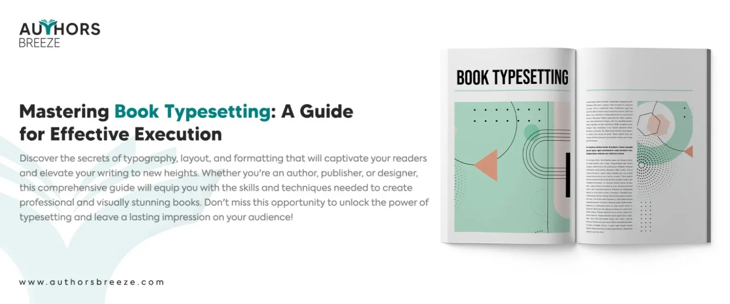
Typesetting might sound like a fancy word, but it plays a crucial role in bringing a book to life. Think of it as the art of arranging text and images on a page. It creates a visually pleasing and reader-friendly experience.
In the world of book production, typesetting is like the magician behind the scenes. It’s responsible for making sure the words flow seamlessly, the font is just right, and the layout is pleasing to the eye. Without typesetting, books would be a jumbled mess of words with no structure or charm.
So, why is typesetting so important? Well, imagine you write a book that’s poorly typeset. The text might be squished together, the font might be difficult to read, or the spacing might be all wrong. It would be a nightmare for any reader. Typesetting ensures that the book is not only visually appealing but also enhances the reading experience.
What is Typesetting?
Have you ever wondered how books look so polished and professional? It is because of typesetting. Typesetting meaning: Typesetting is like the secret sauce of book design. It is the process where writers arrange text and images in a way that makes the book easy to read and visually appealing before submitting it to the book publishers.
Typesetting takes care of everything from choosing the right font and font size to arranging paragraphs and chapters. It’s responsible for creating the perfect balance between text and white space. It makes sure your eyes can glide smoothly across the page.
Typography and layout are two essential items in the typesetting recipe. Typography refers to the art where we choose and arrange fonts. Each font has its own personality. The right font can set the mood for your book, whether it’s playful, elegant, or serious. In addition, we set the right size, spacing, and line height in typography to ensure readability. You may choose book cover fonts to make strong first impressions, but when it comes to selecting the fonts for your manuscript, they should be easy to read.
Layout, on the other hand, is all about how the elements are organized on the page. It’s like arranging puzzle pieces to create a harmonious picture. The layout determines where the text, headings, images, and other elements go. It considers factors like margins, spacing, and alignment to create a visually pleasing and balanced design.
Key Elements in Typesetting a Book
Now, let’s take a quick tour of the key elements involved in typesetting a book.
First, we have fonts and font sizes. Choosing the right font can make a world of difference in the overall look and feel of your book. Font sizes, on the other hand, ensure that the text is readable and comfortable for the eyes.
Next, we have paragraph and line spacing. Have you ever tried to read a book with cramped lines? It’s not a pleasant experience. Proper spacing between lines and paragraphs helps the reader navigate through the text effortlessly and improves comprehension.
Headers, footers, and page numbering are essential elements that give structure to your book. They provide important info, such as chapter titles and page numbers. It makes it easier for readers to navigate through the book and find what they’re looking for.
Lastly, we have styles and formatting. Styles help maintain consistency throughout the book by applying predefined formats to headings, subheadings, and body text. Formatting involves adjusting the alignment, indentation, and other visual aspects to create a polished and cohesive look.
How to Typeset a Book?
Step 1. Prepare Your Manuscript
Before you delve into typesetting a book, you need to make sure your manuscript is ready for the journey. Your manuscript is the foundation of your book. So, prepare it well. It sets the stage for successfully typesetting a book.
Format Your Manuscript for Typesetting
Firstly, it is crucial to format your manuscript for typesetting. It means you need to ensure that the text is clean, organized, and free from any distracting elements. Remove any extra spaces, random tabs, or funky formatting that might have snuck in. You want your manuscript to be a clean canvas for the typesetting.
Correct Errors, Inconsistencies, and Formatting Issues
Then, it’s time to correct any errors, inconsistencies, and formatting issues. Scan through your manuscript with a keen eye, on the lookout for typos, misspellings, or grammar gremlins. Fix any wonky punctuation, and make sure your quotation marks play nicely. Consistency is key. So check that your formatting is uniform throughout the manuscript.
Choose the Appropriate Font
Now, let’s talk about typesetting fonts. Choosing the right font is like finding the perfect pair of shoes for your manuscript. It should complement the tone and genre of your book. Are you writing a whimsical children’s story? A playful and quirky font might be just the ticket. Or maybe you’re working on a historical romance novel? A classic and elegant font could set the right mood.
Font size is equally important. You want your readers to be able to read your words without squinting or straining their eyes comfortably. Too small, and they’ll need a magnifying glass. Too big, and it might feel like they’re reading a picture book. So, strike the right balance by choosing a font size that’s easy on the eyes and suits your target readers.
Step 2. Page Layout and Design
Now that your manuscript is ready, it’s time to pay attention to page layout and design elements. As a result, you can create a book that’s not just visually appealing but also easy to navigate.
Determine the Book’s Trim Size and Set Up Margins
Trim size refers to the final dimensions of your book. Will it be a compact, pocket-sized book or a hefty coffee table tome? Consider the genre, reader preferences, and practicality when making this decision. Once you’ve settled on the trim size, it’s time to set up the margins. Margins are the empty spaces around the edges of the page. They provide room for the text and prevent it from feeling cramped. Play around with different margin sizes until you find the perfect balance between aesthetics and readability.
Select Appropriate Line Spacing and Paragraph Indentations
Line spacing refers to the vertical space between lines of text. Find the sweet spot that allows for easy reading without lines blending together or feeling too spread out. Try different line spacing options to see what feels most comfortable.
Paragraph indentations, on the other hand, give your text a neat and organized appearance. They create a visual cue that signals the start of a new paragraph. Decide how much indentation you want and ensure consistency throughout the manuscript.
Create Headers, Footers, and Page Numbering
Headers, footers, and page numbering are like the navigational aids in your book. They provide essential info and guide readers through the pages. Headers typically display the book title or chapter title at the top of each page. At the same time, footers can include the author’s name or the book’s subtitle. Page numbering is crucial for readers to keep track of their progress. Decide where you want these elements to appear on the page, and then make sure they are positioned consistently.
Step 3. Typesetting Body Text
When you have your pages set up, it’s time to work on the body text. It is where your story resides, and you have to make it as pleasant and easy to read as possible.
Adjust Leading and Kerning for Improved Readability
First, let’s talk about leading and kerning. Leading refers to the vertical space between lines of text. Adjusting the leading can make a big difference in readability. Too tight, and the lines might feel squished together. Too loose, and they might feel disconnected. So, find the right balance that ensures your readers can effortlessly glide through the text.
On the other hand, Kerning is all about the space between individual letters. Some letter combinations might create awkward gaps or collide with each other. Kerning helps fine-tune the spacing between letters to ensure they flow smoothly and harmoniously. It’s like giving each letter its own personal space to shine.
Manage Hyphenation and Justification
Hyphenation and justification are two friends that work together to create a polished look for your text. Hyphenation helps break words at the end of lines to avoid awkward spacing. It ensures that the text remains tidy and balanced. Justification, on the other hand, refers to the alignment of the text along the margins. You can choose between left-aligned, right-aligned, centered, or fully justified. Each option creates a different visual effect. So choose the one that suits your book’s style and tone.
Apply Styles and Formatting to Headings, Subheadings, and Body Text
Now, let’s bring some style and formatting to your text. Headings, subheadings, and body text all need their own distinct types to stand out and guide the reader. Titles should be bold and eye-catching, indicating the start of a new section. Subheadings can be slightly smaller but still prominent enough to grab attention. Body text is where the majority of your story resides, so choose a font and size that’s easy to read without causing eye strain.
If you apply consistent styles and formatting throughout your book, it gives it a cohesive and professional look. It makes sure that readers can easily navigate through the different sections and makes your book visually appealing.
Step 4. Handle Images and Illustrations
Images and illustrations are potent tools to captivate your readers. Therefore, you should bring visual delight to your book. Let’s explore how to handle images and illustrations like a pro.
Place Images in the Manuscript
First, let’s talk about placing images in the manuscript. Think about where you want the picture to appear and how it relates to the text. Is it a standalone image, or does it enhance a specific section? Once you’ve decided, find the perfect spot and insert the image. Make sure it complements the surrounding text.
Adjust Image Size, Alignment, and Captioning
Now, let’s get into the nitty-gritty of image adjustments. Size matters! Adjust the image size to fit harmoniously within the layout. You don’t want it to overpower the text or get lost in a sea of words. So, try different sizes until you find the perfect balance.
Alignment is another crucial factor. Do you want the image to be centered, left-aligned, or right-aligned? Choose the alignment that enhances the overall aesthetic and supports the flow of the text. This way, the image becomes an integral part of the page’s visual composition.
Don’t forget about captions! Captions provide context and information about the image. It could be a brief description, the source, or even a witty remark. Captions are usually placed below or beside the image and can add an extra layer of engagement for the reader.
Manage Image Placement in Relation to the Text
Now comes the delicate dance of managing image placement in relation to the text. You want to maintain a harmonious balance between images and text. So, avoid situations where an image cuts off a sentence or disrupts the flow. Also, be mindful of the white space around the image. Ensure that it doesn’t crowd or overpower the neighboring text.
Step 5. Add Special Elements
Before finalizing typesetting a book, there are still a few special elements you need to incorporate to make your book shine even brighter. Let’s explore how to incorporate these elements seamlessly.
Incorporate Tables, Graphs, and Other Visual Elements
First up, we have tables, graphs, and other visual elements. Sometimes, your book might require presenting info in a structured way or showcasing data through graphs and charts. When adding tables, ensure they are clear and organized, with proper headings and labels. Graphs and charts should be visually appealing and easy to understand. So, place them strategically within the text where they provide the most value and enhance comprehension.
Insert Footnotes, Endnotes, and Citations
Footnotes, endnotes, and citations are also vital aspects of a well-crafted book. Footnotes appear at the bottom of the page. Endnotes are listed at the end of a chapter or the entire book. These notes provide additional info, explanations, or references that enrich the understanding of the readers. Citations, on the other hand, give credit to the sources you’ve referenced. Suppose you properly format and place these elements. In that case, it ensures that readers can access additional context without interrupting the flow of the main text.
Handle Special Characters, Accents, and Diacritics
Special characters, accents, and diacritics add linguistic flavor to your book. They might include symbols, foreign characters, or accented letters. It’s crucial to handle these elements with care. Ensure they appear correctly and maintain consistency throughout the text. Use the appropriate fonts and character sets to display these special characters accurately.
Step 6. Proofreading and Quality Assurance
Before you unveil your book, you must ensure it’s flawless. Therefore, you have to find proofreaders for hire and acquire their services to ensure your book is polished to perfection.
Conduct Thorough Proofreading for Errors and Inconsistencies
First things first, it’s time for some serious proofreading. So, grab your magnifying glass and eagle eyes, and scour the pages for any sneaky errors and inconsistencies. Then, check for typos, misspellings, punctuation errors, and grammar gremlins. Also, look out for pesky homophones that might have slipped through the cracks. Finally, read each sentence carefully to ensure it flows smoothly and makes sense. Remember, thorough proofreading will catch those little hiccups that can disrupt the reader’s enjoyment.
Check for Widows, Orphans, and Other Typographical Issues
Next, tackle typographical issues. Widows and orphans might sound like characters from a fairytale, but they’re actually typographical problems. Widows occur when a paragraph ends with just a single word on a line, creating an awkward visual gap. Orphans, on the other hand, are lone words or short lines that appear at the beginning of a paragraph. These can disrupt the visual flow of the text. Make sure to adjust your layout to eliminate these pesky creatures and maintain a consistent and pleasing appearance.
Test the Layout on Different Devices and Formats
Once the proofreading and typographical issues are under control, it’s time to test the layout on different devices and formats. Your book should be compatible with various reading platforms and devices. Check how it looks on e-readers, tablets, and other screen sizes. Ensure that the formatting, fonts, and images appear as intended. Also, the text is legible across different formats. You want your book to look its best, regardless of the reading device.
Step 7. Export and Finalize the Typeset Book
After proofreading and assuring quality, it’s time to export and finalize your beautifully typeset book.
Export the Typeset Book to the Desired Format (PDF, ePub, etc.)
The first thing to do is to export the book to the desired format. Whether you want a PDF for print, an ePub for e-readers, or any other form, make sure to choose the appropriate export option. Each book format has its own requirements and specifications. Take a deep breath, click that export button, and watch as your words and design come together in a digital package.
Ensure File Compatibility and Proper File Organization
When you export, ensure file compatibility and proper file organization. Double-check that the exported file is compatible with the intended reading devices or platforms. Make sure all fonts, images, and special elements are embedded correctly. Also, organize your files in a logical and structured manner. So you can easily access and distribute them. Keep backups of your files for safekeeping, just in case.
Review the Final Typeset Version
Once you have the final typeset version in your hands, take a moment to review it with a keen eye. Read through the entire book once more. Look for any last-minute tweaks or adjustments. Check for any visual inconsistencies, formatting errors, or lingering typos. Ensure that everything is aligned as it should be and that the overall presentation is top-notch.
If you spot any issues during your review, make the necessary adjustments. Fix any errors and adjust spacing or formatting as needed. Also, ensure a smooth and consistent reading experience. Keep in mind this final review is your last chance to perfect your book before it meets the eager eyes of readers.
FAQs
What is Typesetting for a Book?
Typesetting is the crucial phase where you prepare a book for printing. It involves the meticulous arrangement of physical or digital type elements such as letters, symbols, and glyphs on a page. It occurs after the manuscript has undergone editing and ensures that the final product is ready to be printed.
How Much Does Typesetting a Book Cost?
The cost of traditional print book typesetting typically ranges around $3.50* per page. It may vary based on the complexity of the book. Several factors contribute to determining the final price, including the number of languages used and the overall length of the text. In addition, there is an additional setup fee of $100 for books comprising less than 150 pages.
What is the Typesetting Rule?
In typesetting, a general guideline is to ensure that there are at least two lines of text positioned beneath the subhead on the same page. This rule of thumb is particularly relevant when a subhead appears near the bottom of a page. If you maintain a minimum of two lines below the subhead, you can ensure proper spacing and visual clarity in the layout.
How Long Does it Take to Typeset a Book?
Typically, the completion of the entire typesetting process generally takes approximately one week for an average 60,000-word book. However, the overall timeframe may vary based on the complexity of the book.
Conclusion
Throughout this guide, we’ve explored the essential steps in typesetting a book. But why is all this effort worth it? A well-typeset book is necessary for a delightful reading experience. It captures the attention of readers with its visually appealing layout, easy-to-read text, and seamless flow. It enhances comprehension, which makes it easier for readers to navigate through the content and absorb the message you’re conveying.
A well-typeset book is a treat for the eyes. It immerses readers in your words and creates a connection that goes beyond the text. So, if you want to attract more readers and let your book reach new heights, avail our services for authors. Authors Breeze can help you typeset your book and enhance its readability.


